
MetaMask (Consensys) Web3
Zero out of twelve. Redesigning MetaMask Card for 30 million users.
“Someone needed to just shout it: get USDC on Linea, here’s how to swap. That’s it. Nobody was saying that.” — P1, Power User. Onboarding research session.
- Role
- Lead Product Designer
- Client
- MetaMask (Consensys)
- Scope
- Research, interviews, prototype testing.
- Timeline
- 2025
BackgroundA product problem disguised as a UX problem
That quote came from a power user, someone already comfortable with crypto. Even they could not fund the card without being walked through it. For less experienced users the picture was worse: in our research sessions, zero out of twelve participants completed onboarding without assistance, and the average time to complete ran past forty minutes.
The interface assumed people thought like blockchain developers. Most of them just wanted to spend their money. MetaMask Card was deliberately marketed beyond the Web3 core, to people who had bought ETH, held it, maybe moved it once. Bridging, swapping and layer-2 networks were unfamiliar at best and intimidating at worst.
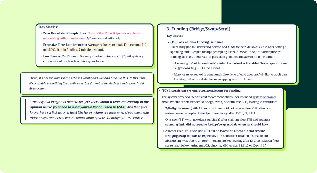
I joined as Lead Designer on the Card team during a critical window: the product was live and conversion was broken. My scope ran the full onboarding experience, from post-KYC to first spend. I helped write the research scripts and sat in on the interviews, listening for how people actually talked about money, then prototyped and ran unmoderated testing before anything reached engineering. Research to design to validation. I owned that loop.
The breakThree places the flow assumed too much
The unguided funding drop-off
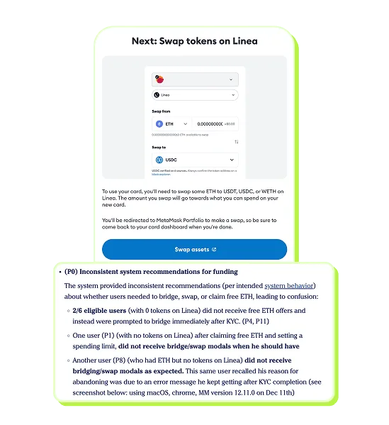
After a nineteen-minute KYC, users without USDC on Linea met a modal telling them to swap their tokens, then were handed to MetaMask’s native swap interface. No explanation of what Linea was. No reason why USDC specifically. No path back. Dropped into a swap screen mid-journey, people did not know what they were looking at or whether they were about to lose money.
The spending limit intimidation
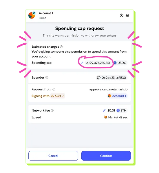
Then the delegation screen offered a default spending cap of $2,192,020.00 USDC. The number was not just large; it was formatted like a contract, because it was one. The label “spending cap” read as permanent access to their funds at that scale. Research flagged it explicitly: users were not confused so much as frightened. Two options sat at equal visual weight, neither explained in terms anyone non-technical could evaluate.
No path forward after onboarding
And anyone who made it through had no persistent guidance. Skip a step and the dashboard gave no signal about what was missing. The product assumed a completion that had not happened.
DecisionsStructure first, then abstraction
People don’t abandon hard things. They abandon unclear things. Make the path visible and most people will walk it.
Replace chaos with a stepper
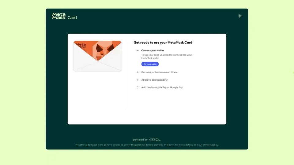
The problem was never a single screen. Users had no mental model of the journey. So I made the path the structure: a four-step stepper, named in plain English. Connect wallet. Get compatible tokens. Approve card spending. Add the card to Apple Pay or Google Pay. It told people the journey was finite before they started, let them skip what they had already done, and made progress visible.

The stepper was not the first direction. We explored putting the checklist inside the app, surfacing on the dashboard after sign-in. But KYC alone took nineteen minutes, and dropping people into an app shell with more setup made the finish line feel like it had moved. A standalone stepper reframed it: this is the last stretch, not more of the same.
Speak the language users already had
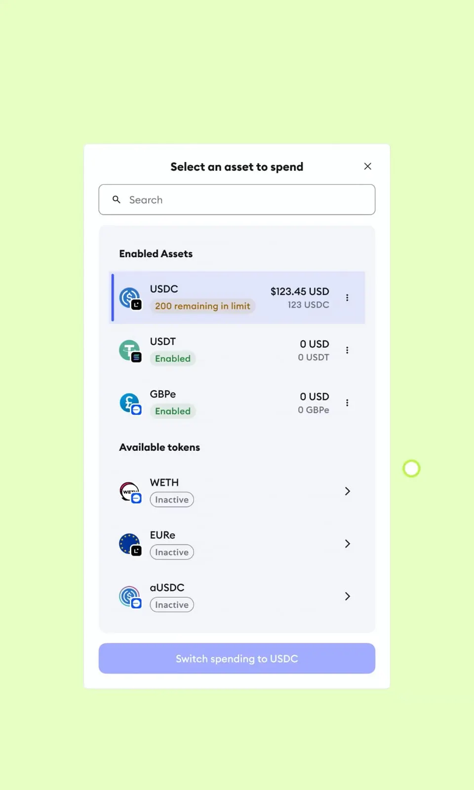
Research turned up something specific: people recognized token logos instantly and struggled with token names in text. The blue circle with the dollar sign was obvious; “USDC on Linea” required prior knowledge. I replaced text token references with the token chips people already knew from their wallets, and when we went multi-chain the chain selector became logos rather than network names. Every word removed that required blockchain literacy was a point of friction gone.

Abstract the funding complexity in two phases
Funding was the hardest problem and the team solved it twice. Phase one surfaced exactly what was needed: compatible tokens, the chains they lived on, a direct path to get them. It listened for the swap completion event too, so people were returned to the stepper automatically. Phase two integrated Daimo Pay, routing deposits from other chains and bank rails to the supported token with no manual bridging at all. The complexity did not disappear; it moved underneath.

Make the spending limit decision disappear
The spending limit needed an opinion rather than a choice. Early wireframes still showed automatic approval and a custom limit at equal weight, which was the same mistake in a better layout: asking for a decision nobody had context for. The final design removed the choice from the default view entirely: one clear action, described in plain language, with the custom limit behind an “Edit limit” link for anyone who went looking.
Design for users who don’t finish
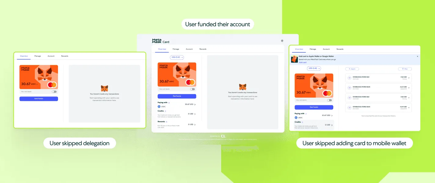
Not everyone gets through in one session. Some skip the token step meaning to come back; some dismiss the Apple Pay prompt. The original dashboard had no way to re-engage them, so I designed three persistent states: an empty state with “Add Funds” placed around the card rather than buried in a menu, a banner for anyone who skipped Apple Pay or Google Pay, and a token management screen repeating the same approval pattern they had already learned. Onboarding does not end when the stepper ends.
OutcomeAt this scale, a UX metric is a revenue metric
- Improvement in delegation completion
- ~50%
- Users the flow serves
- 30M+
Every point of delegation completion is more people actually spending with the card. The first pilot launches in the UK, EU and Latin America showed what that looks like in the first month:
- Spent on-chain in the first month
- $1M+
- Daily cardholder spend, first month
- $25k+
- On-chain transactions, first month
- 50k+
The Phase 2 multichain expansion carried the same abstraction to Solana and Base without fragmenting into a separate flow per chain: one interface, several chains, no additional cognitive load.
ReflectionBehavior informs design, and the best design is invisible
The abstraction had a ceiling. Once someone approved, MetaMask’s native confirmation surfaced the raw contract parameters: caps in the billions, wallet addresses, tickers. We could not redesign that. Designing inside an ecosystem means working with constraints you do not own.
The people who went through the redesigned flow did not think about what we built. They connected their wallet, got their tokens, approved their card, and spent their money. The blockchain complexity ran underneath the whole time. That invisibility was the goal, and it is also how you know the problem is actually solved.