
PassportMonie Fintech
Make financial infrastructure feel like the beginning of a vacation.
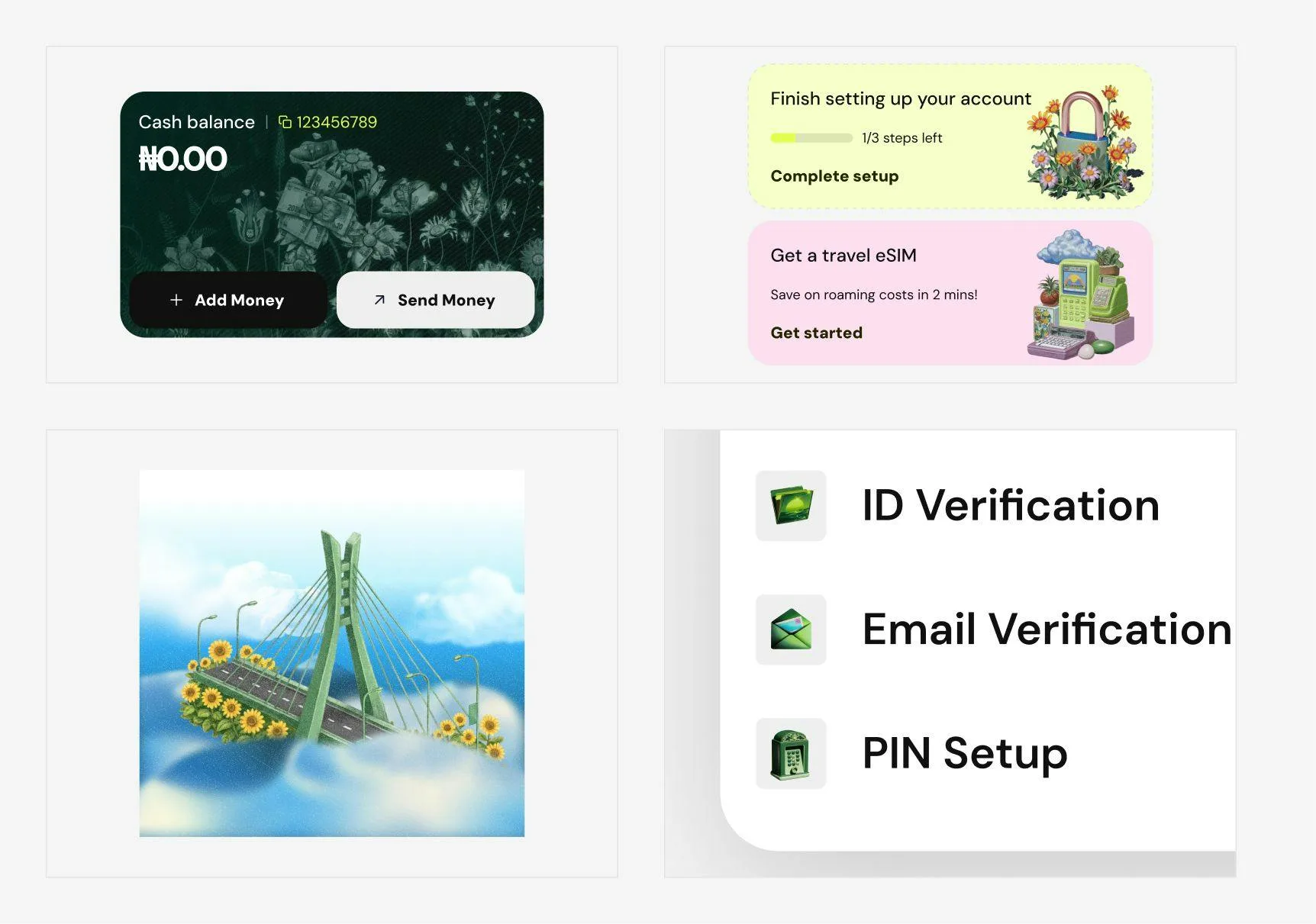
The Carter Bridge floating on clouds with sunflowers is not an accident. It is Lagos, rendered as a place worth leaving from.
- Role
- Art direction, illustration
- Client
- PassportMonie
- Scope
- Brand system, AI illustration, UI assets.
BackgroundA payments app for people who are going somewhere
PassportMonie moves money for people about to travel, and the whole direction came from one sentence: make financial infrastructure feel like the start of a trip.
DirectionVintage gadgets, botanical texture, Lagos
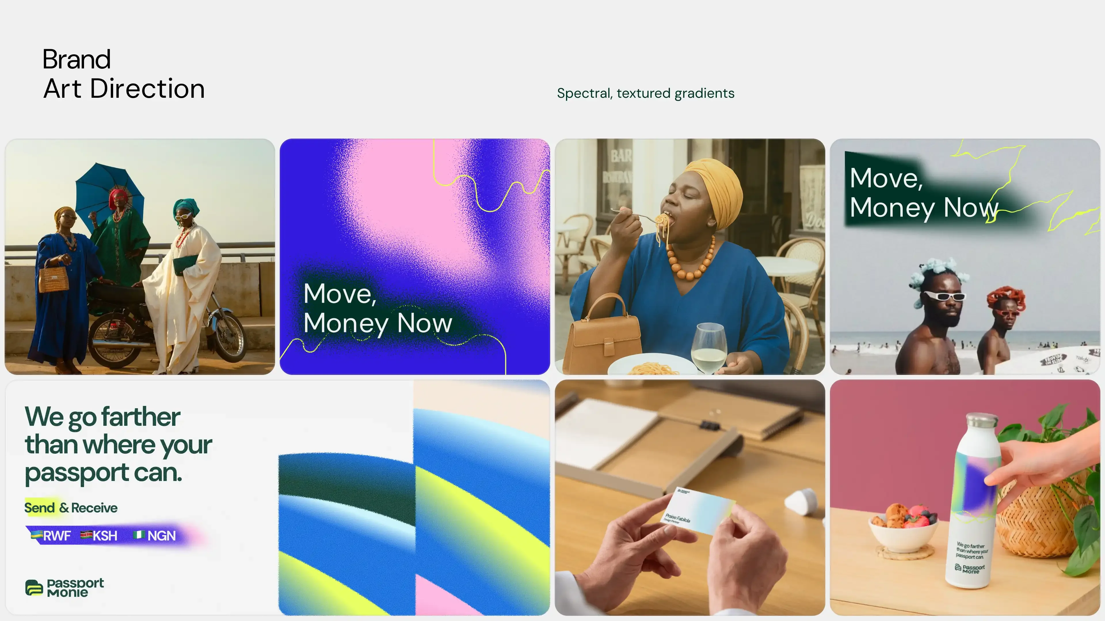
I held three references together at once: vintage gadgets, botanical texture, Lagos iconography. None of them belong together on paper. That's what keeps this from reading like generic fintech branding.
Color, type and gradient
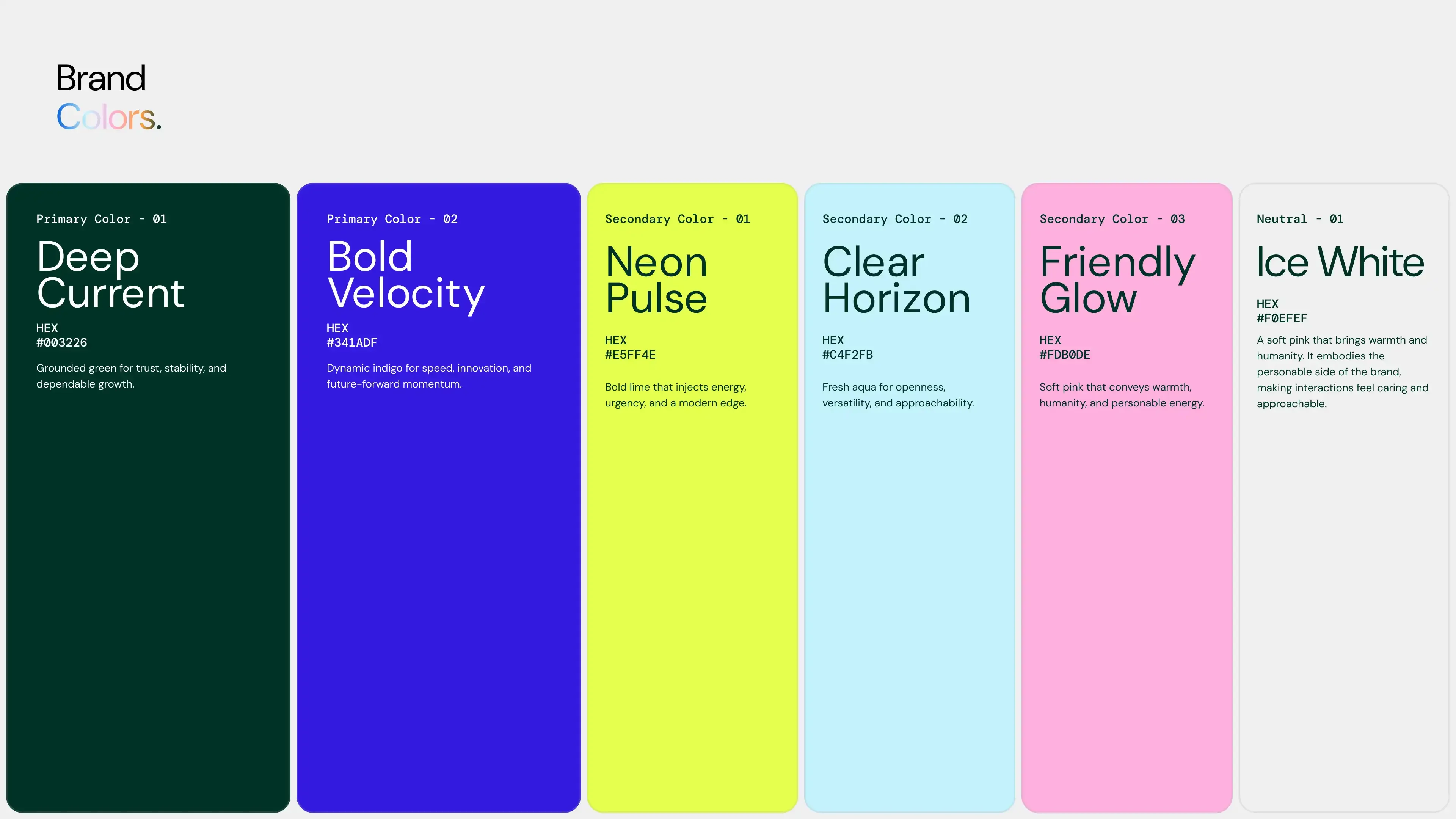
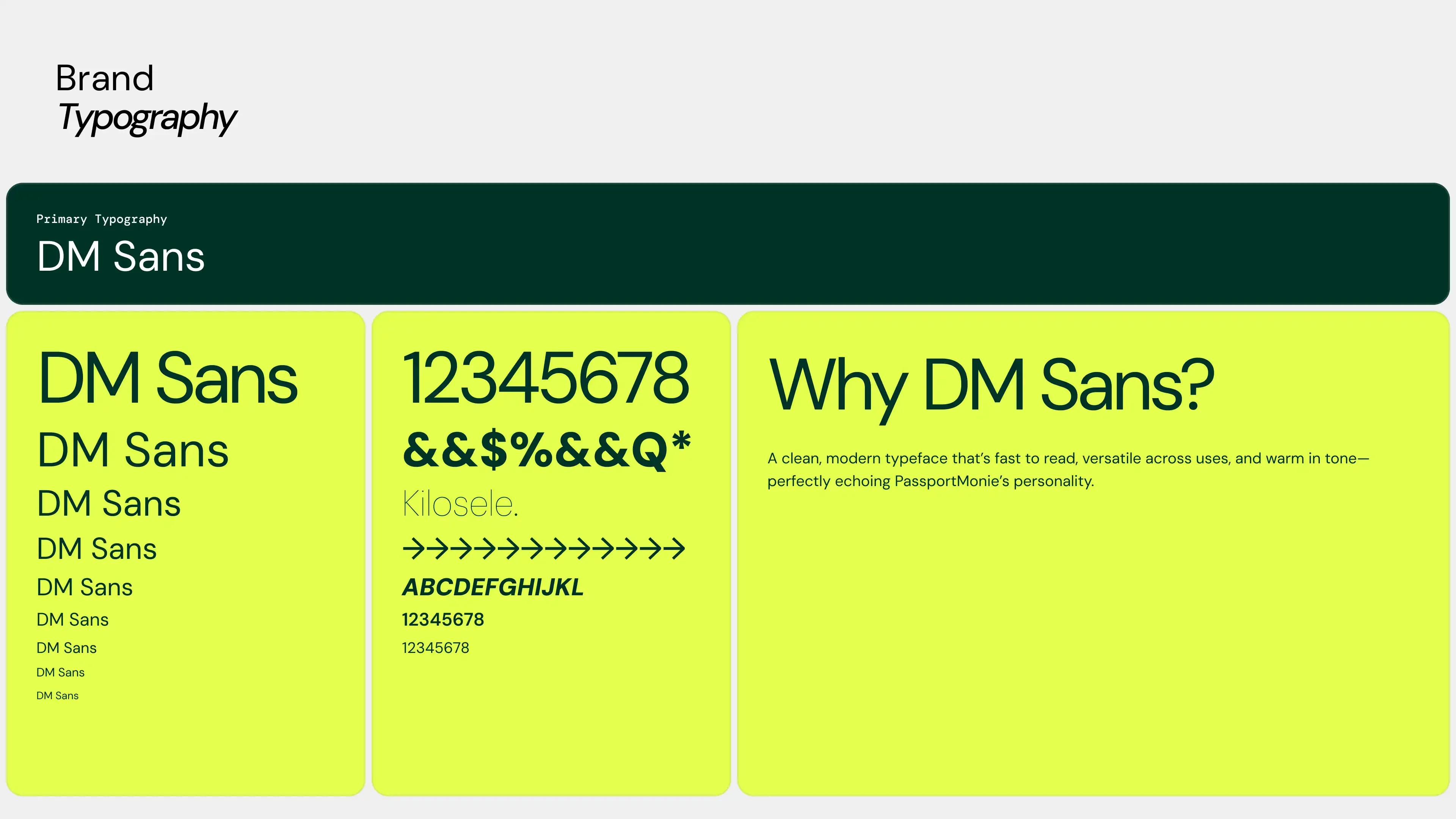
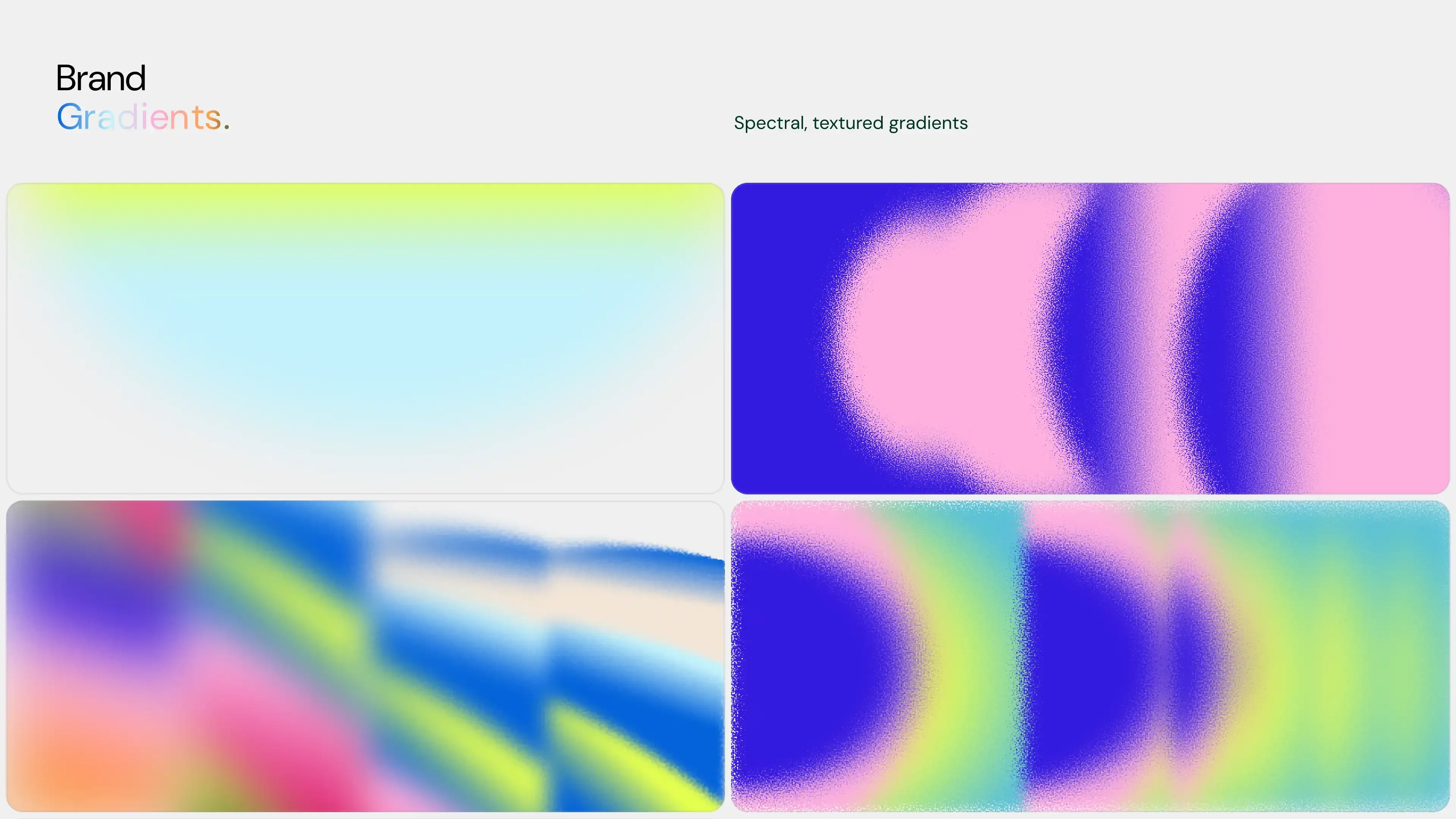
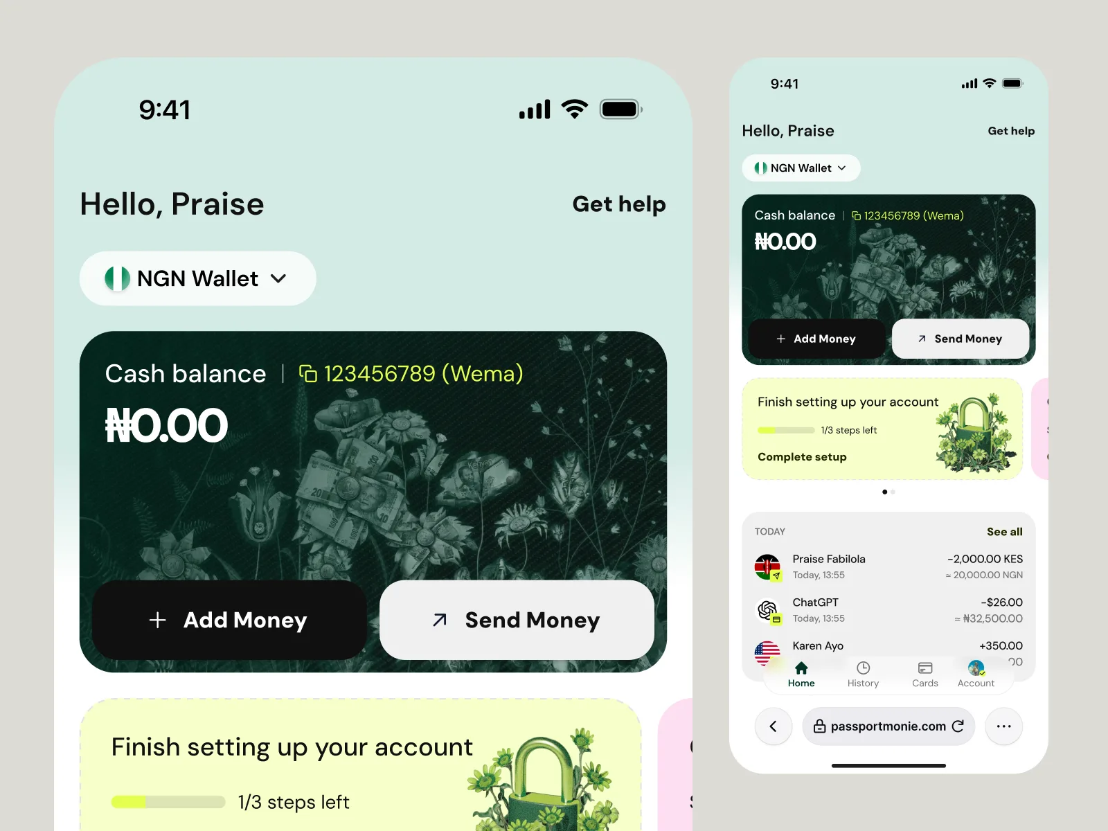
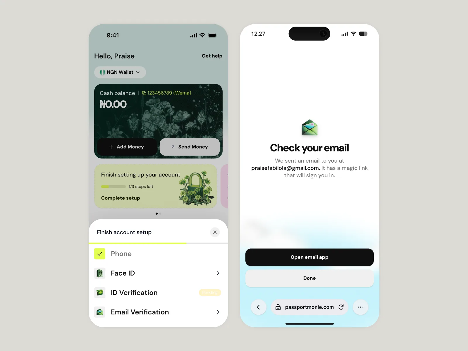
The palette, Deep Current, Bold Velocity, Neon Pulse, Clear Horizon, Friendly Glow, Ice White, runs warm without losing the contrast a financial product needs to stay usable. DM Sans carries the type because it holds up at the small sizes people actually read inside a banking app; nothing about that choice is decorative. The gradients are spectral and textured instead of flat, so the interface reads as material you can touch.

How it should sound
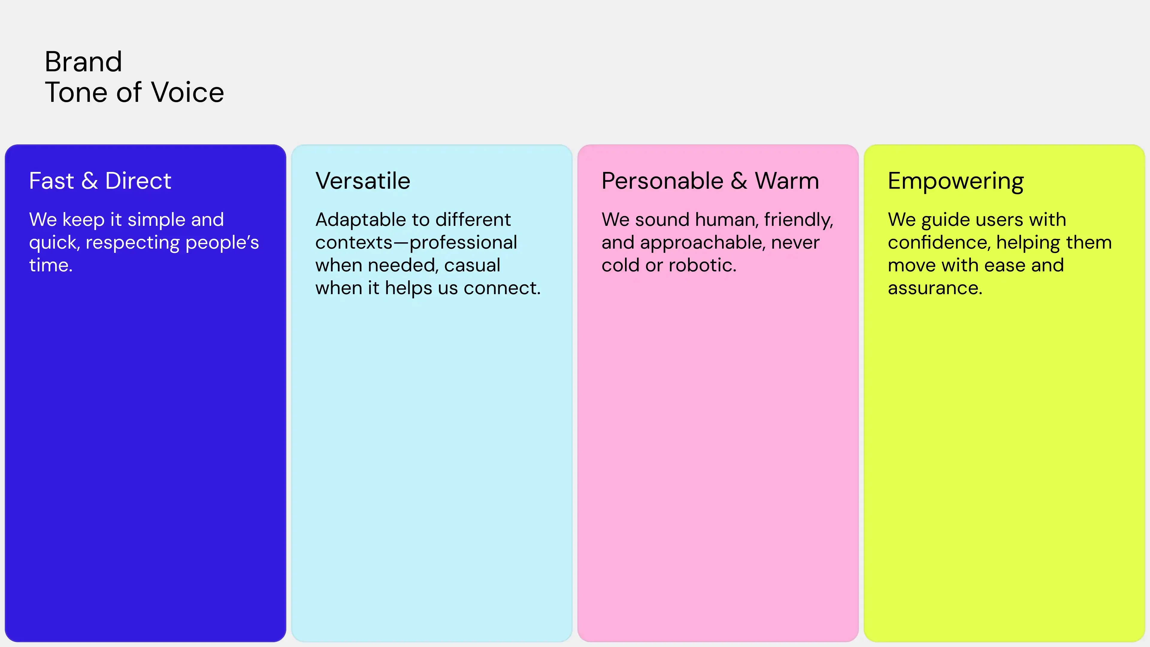
Fast and direct. Versatile. Personable and warm. Empowering. Four words, and each one is there to stop a playful visual system from turning careless in a product where the stakes are somebody's money.
ApplicationsGenerated with AI, shipped to production
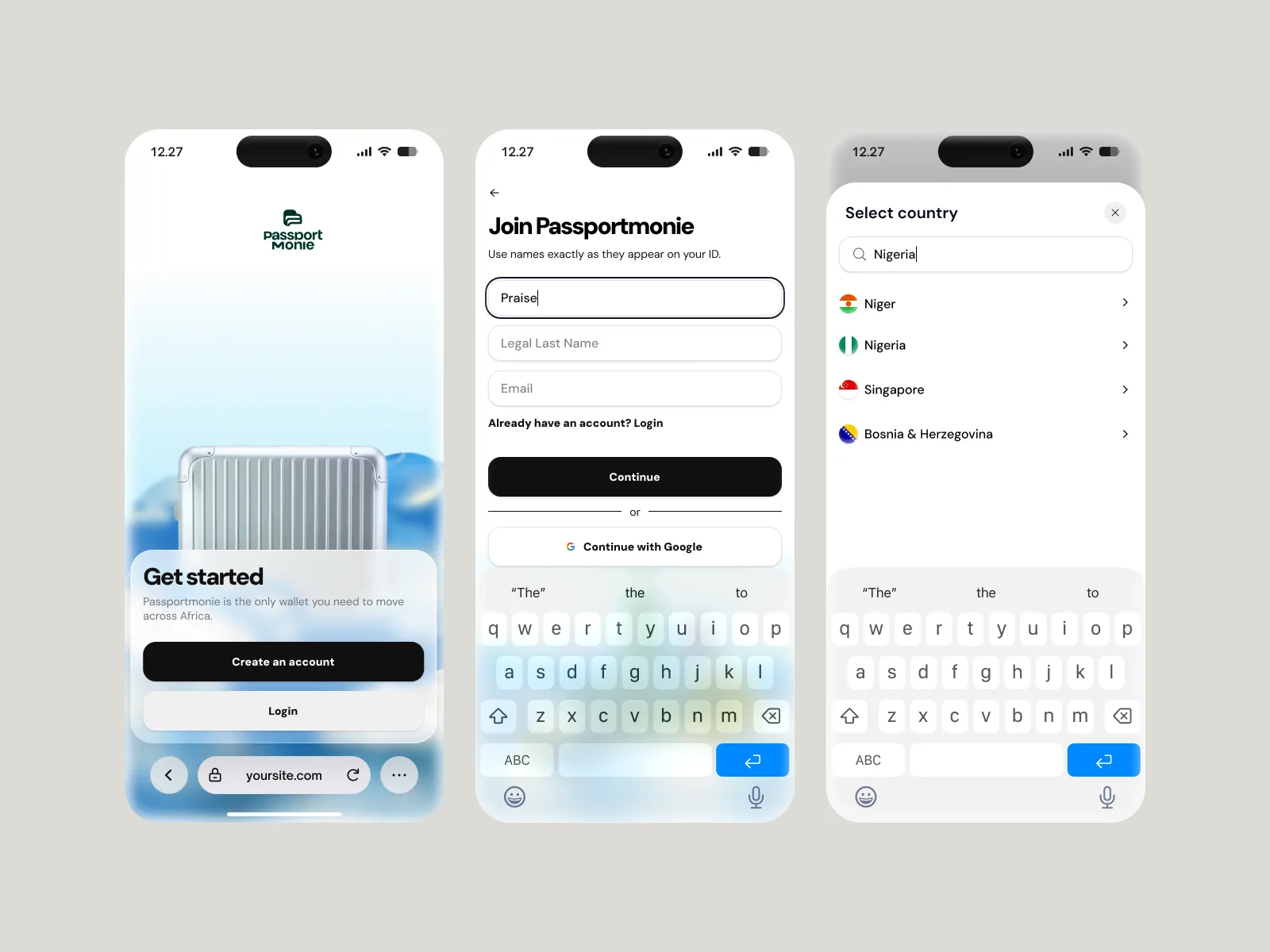
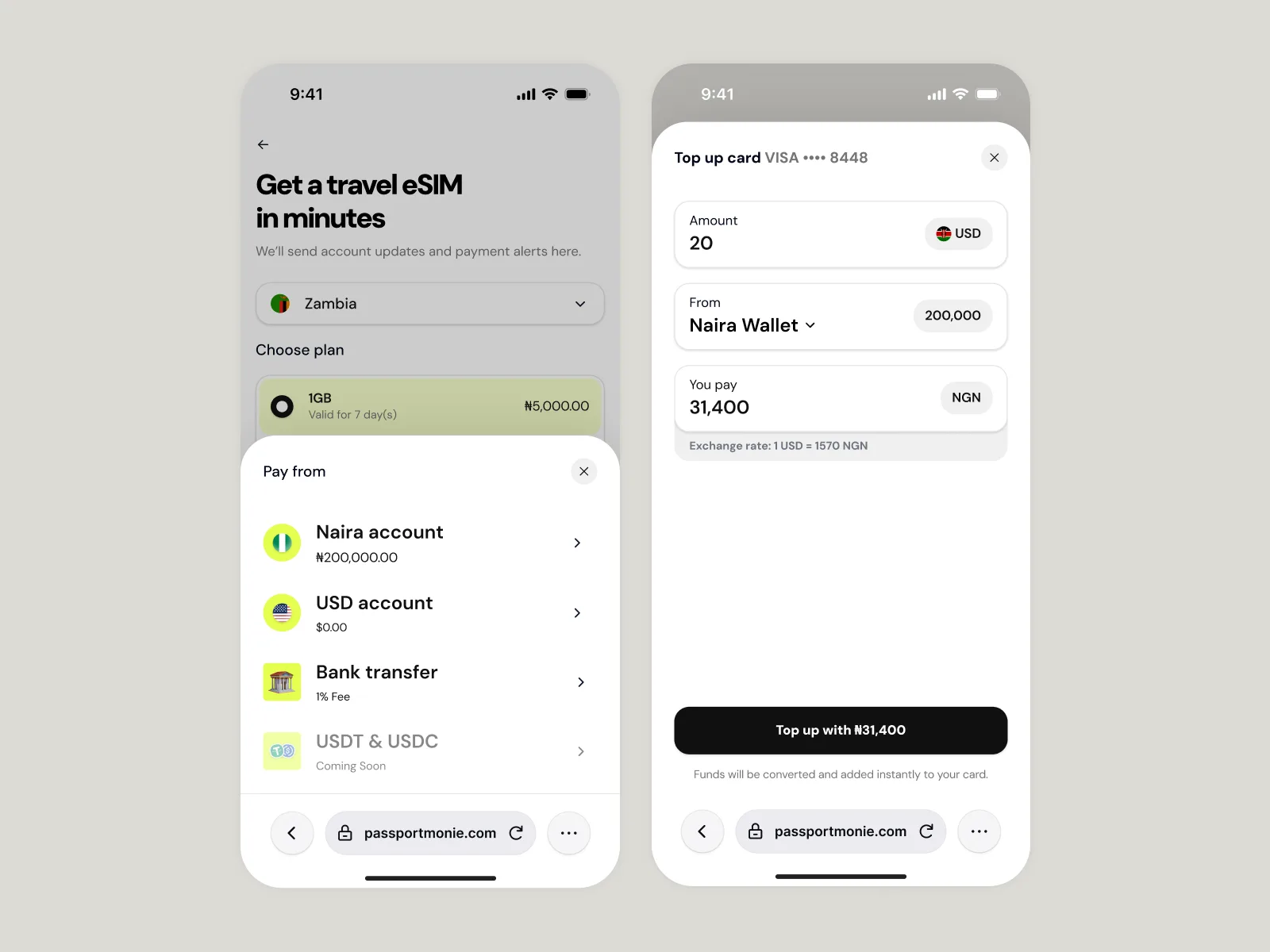
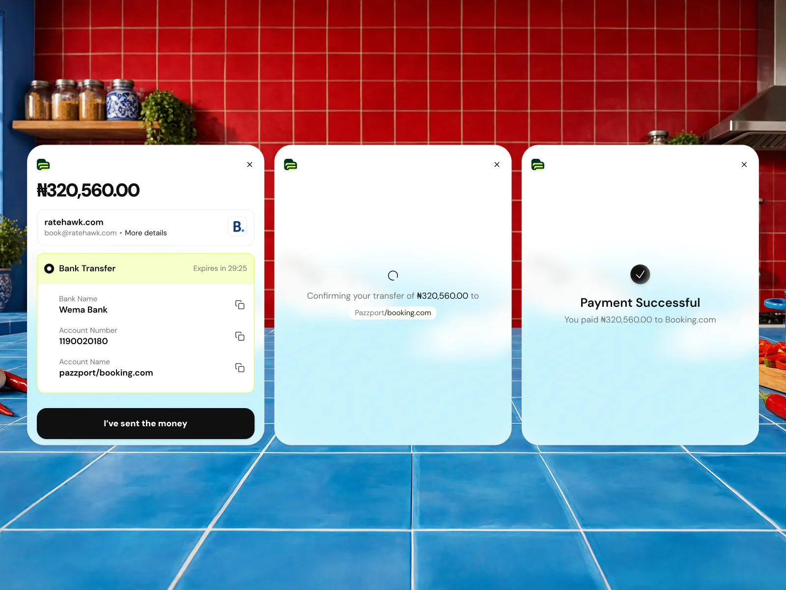
Every asset here was generated with AI and shipped into the live product: onboarding illustrations, wallet card backgrounds, setup banners, a full icon set. One palette runs through all of it. That consistency is the difference between a design system and a folder of nice images.


ReflectionThe brief came before the prompt
The references, the palette, and the tone pillars existed before I generated a single image. That order is the entire point: I'd already made the decisions, the AI only executed them. That's why the output could ship.