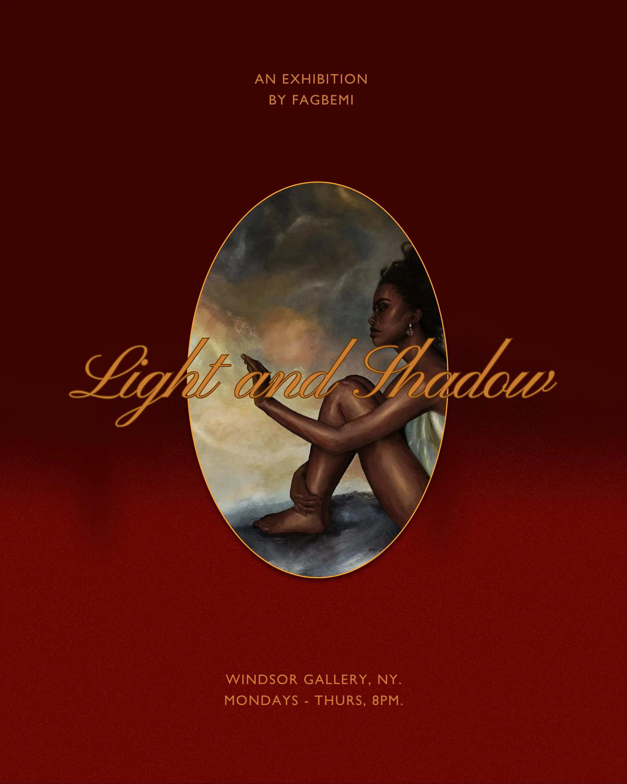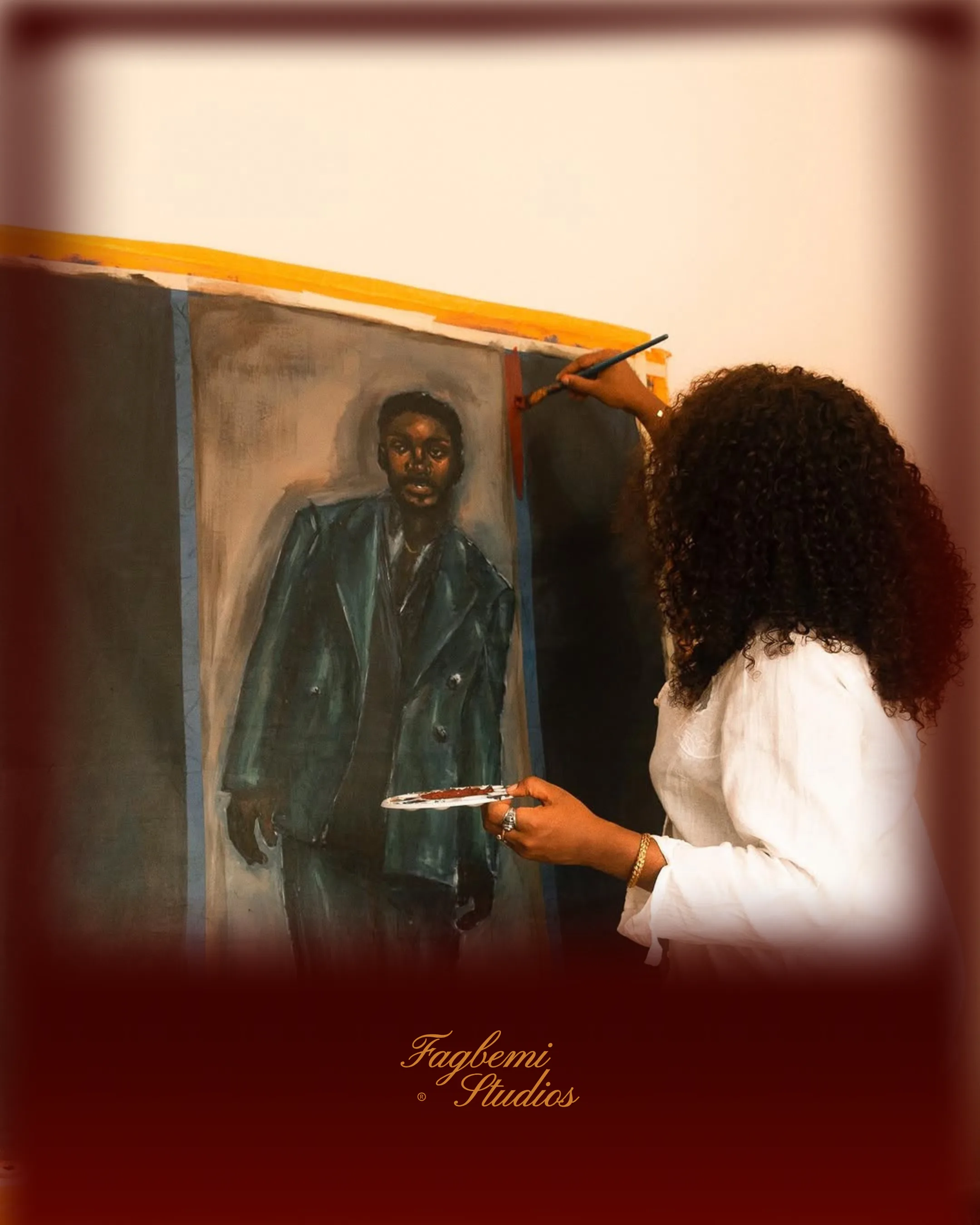
Fagbemi Studios Fine art
A brand that hints at depth instead of explaining it.
Where Memory Lives.
- Role
- Brand identity, AI creative direction
- Client
- Fagbemi Studios
- Scope
- Midjourney, Nano Banana.
BackgroundWork that carries weight instead of announcing it
Fagbemi Studios is a fine art practice. The work sits with pain and memory, unresolved. The brand needed the same restraint: hint at the weight.
The workBuilt around one word: chiaroscuro
I built the entire brief around one word: chiaroscuro. Light and shadow. Memory pulling itself into shape. Most artist branding chases a premium look with gloss. I went the other way and built a visual language heavy enough to hold what the work is actually about.
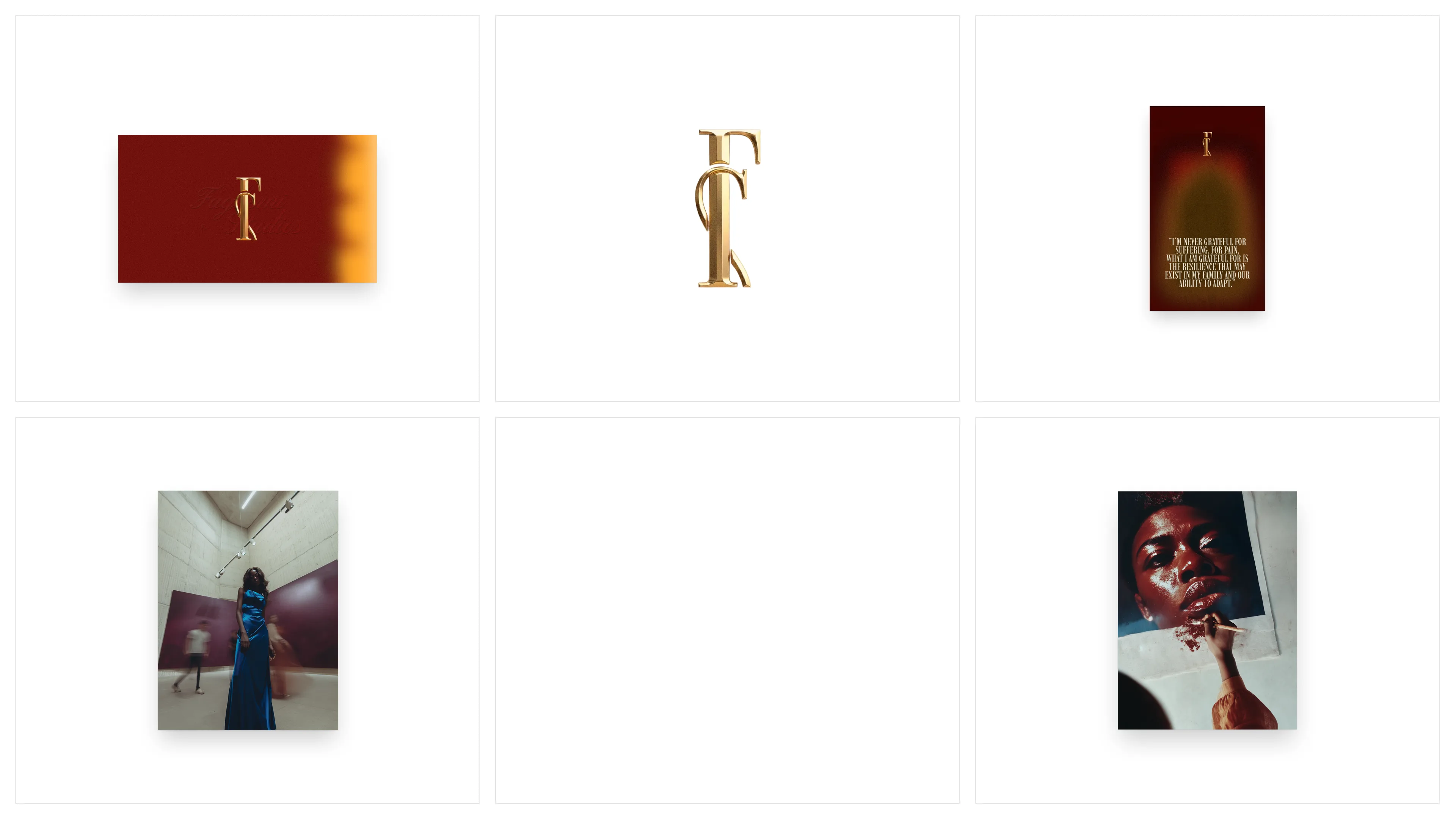
The monogram sits on materials that age on purpose: wax seals, scratched silver plate, gold relief, worn fabric. Each surface makes the mark answer a different question. The photography runs on the same rule: film grain, available light, Black women photographed in quiet authority rather than performance. Nothing in it is staged.
The most considered piece in the system is the quote card, and the words on it are the artist's own:
I’m never grateful for suffering, for pain. What I am grateful for is the resilience that may exist in my family and our ability to adapt.
Set in garnet and gold with the monogram floating above it, the card is the most honest asset in the system: the artist's own words, rendered like they matter. I built the brand language to hold a line like that without flinching.